UX research, Service design, Usability testing
Project overview
Heyhabit is a platform that helps women build healthy habits through small, sustainable changes in daily life. Through professional guidance and support, HeyHabit provides resources that integrate into everyday routines, making long-term behavior change more accessible and manageable.
This project started as a school assignment but has since evolved into an ongoing freelance collaboration, where my colleague and I continue working closely with Heyhabit.
What began as a school assignment has grown into a real product in development, something we are incredibly proud to be part of.
We have taken full ownership of the UX/UI design, developed the MVP in close collaboration with the founder, and guided the product from concept to a live test version. We are now leading user testing and iterative refinements ahead of the first official launch in the coming months.
Below, you can explore the work carried out during the academic phase of the project, where we laid the foundation through in-depth UX research, service design, and usability testing.
Timeframe
14 weeks
UX Researcher, UX/ UI Designer, Service Designer
My role
Tools
Figma, Fig jam, Figma slides, Google forms
Capabilites
UX Research, Service Design, Insight Synthesis, User Flows, Wireframing, Prototyping, Usability Testing, Iterative Design
This project was part of a 14-week course called “UX Research, Service Design & Usability Testing”, held during the second semester of the UX program.
In this course, we collaborated with real companies who needed support with their UX challenges. My team was paired with a startup, called Heyhabit, in its early stages, where only an idea and a raw algorithm existed.
Context
Project breif
Our main goal was to clarify the app’s unique value proposition and gain deeper insights into the target group’s needs and how technology can support them in their everyday lives.
We also set out to design a prototype with a strong focus on coaching, grounded in behavioral science and psychological principles, to promote sustainable lifestyle changes.
The Challenge
How can UX design be used to encourage sustainable behavior change in users?
In modern times, lifestyle-related health issues have increased significantly. Despite this, there are currently too few resources dedicated to managing and researching these conditions.
Investing more in chronic conditions and lifestyle-related health challenges is not only beneficial for individuals – it also has the potential to save society a substantial amount of money in the long run.
HeyHabit is a platform that helps women create sustainable healthy habits through small, manageable changes, offering professional guidance and support to integrate into daily routines for long-term behavior change.
The Solution
UX research

At first, we held a workshop with Heyhabit to get to the core of the 'why', 'how', and 'for whom' of Heyhabit’s existence, which resulted in the creation of an experience map.
Experience map
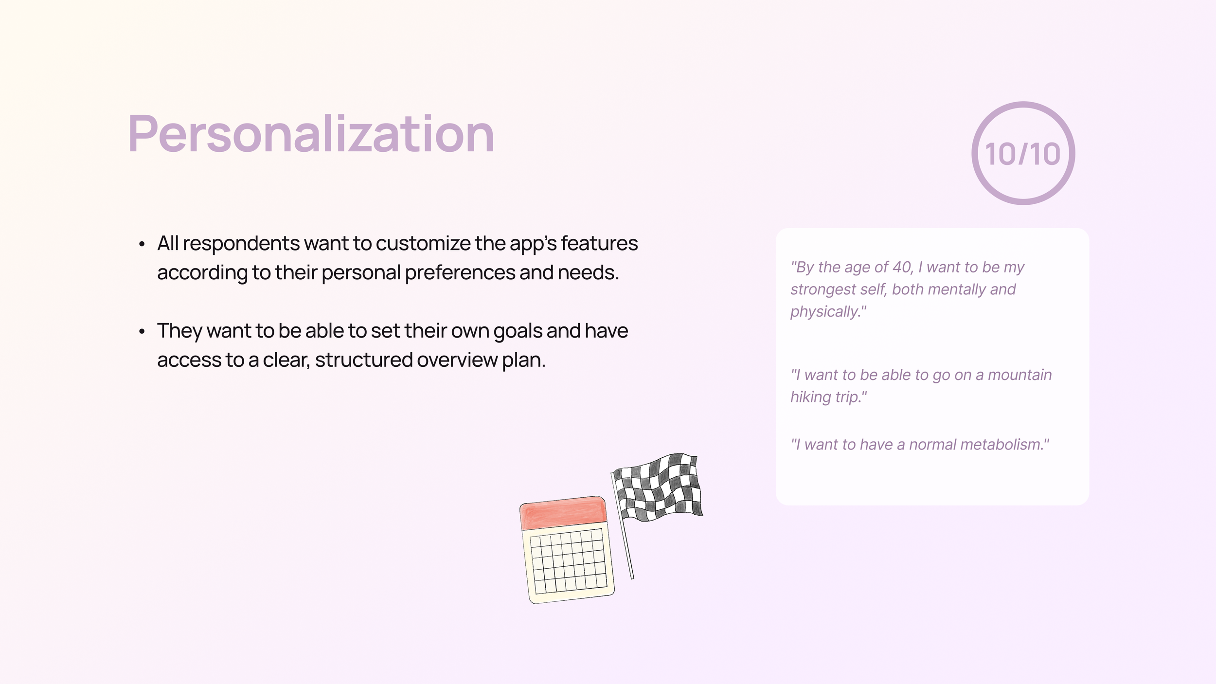
Our primary target audience is women aged 25 to 50 in Sweden, facing lifestyle-related health issues. They are curious about improving their health but struggle with busy lives, limited resources, and frustration with healthcare.
They seek simple, long-term solutions that offer clear information, structure, and support, with customizable reminders and tools to integrate health into their routines without feeling overwhelmed.
Target group analysis

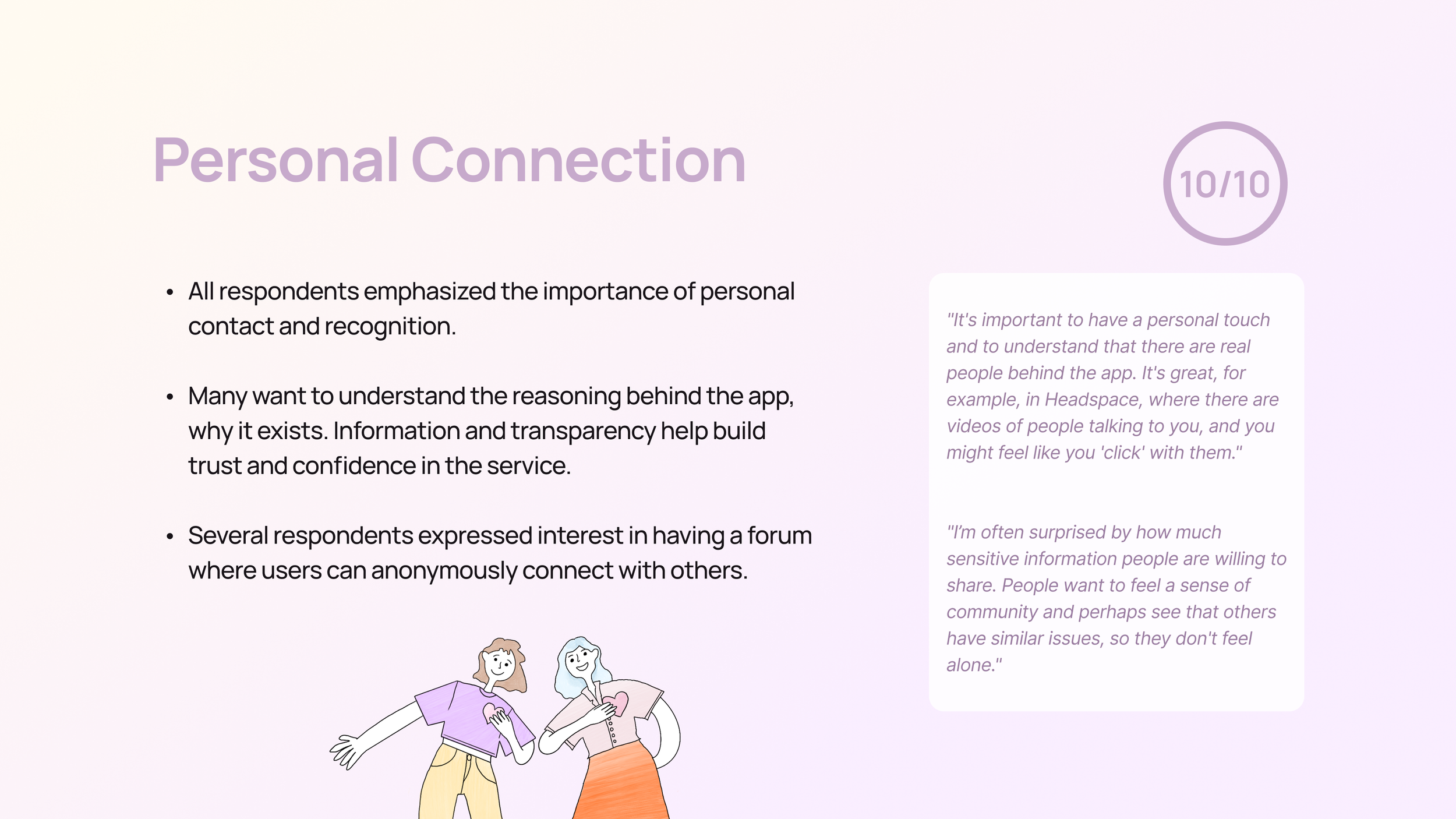
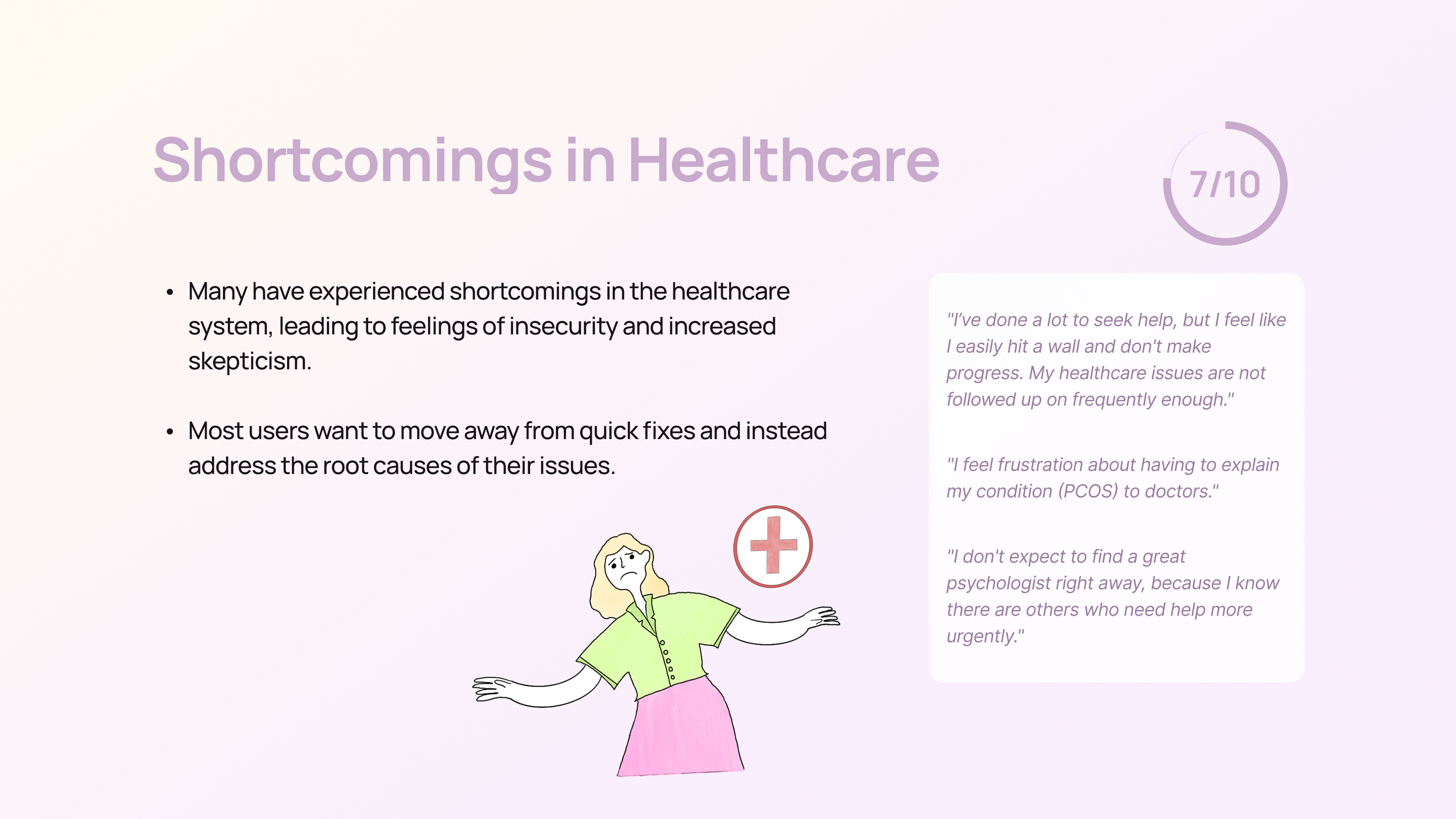
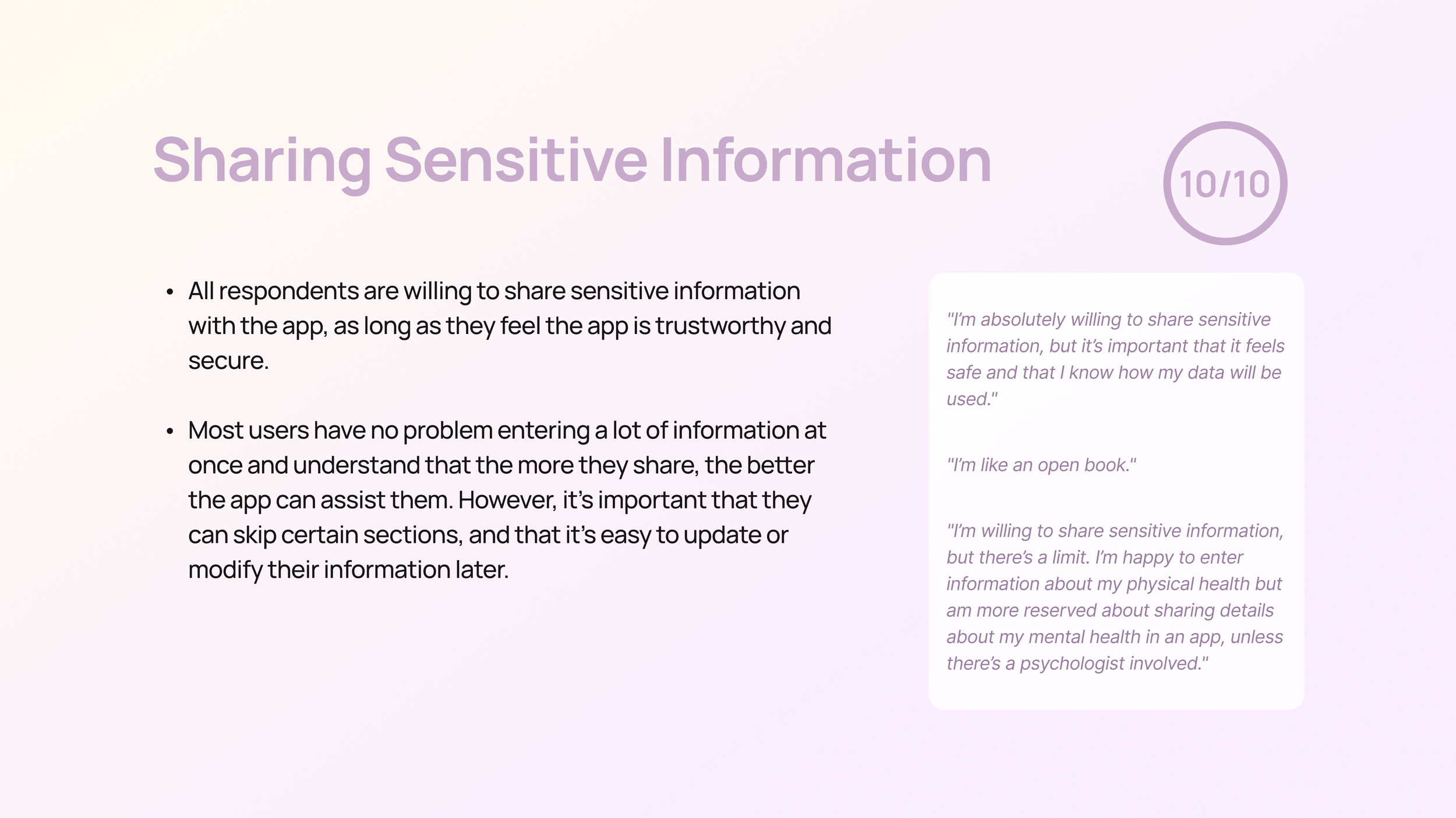
We conducted ten in-depth interviews to gather qualitative insights into users' needs and behaviors. Each interview lasted about an hour and was carried out both remotely via Teams and in person. We chose this method because it allows for handling sensitive information, creating a safer space for participants to provide detailed, thoughtful responses through personal interaction.
Participants were selected from our personal networks, as they closely matched our target audience. We believed that interviewing people we were familiar with would lead to more honest and valuable insights.
After the interviews, we anonymized the participants and assigned them pseudonyms based on their responses.
User study
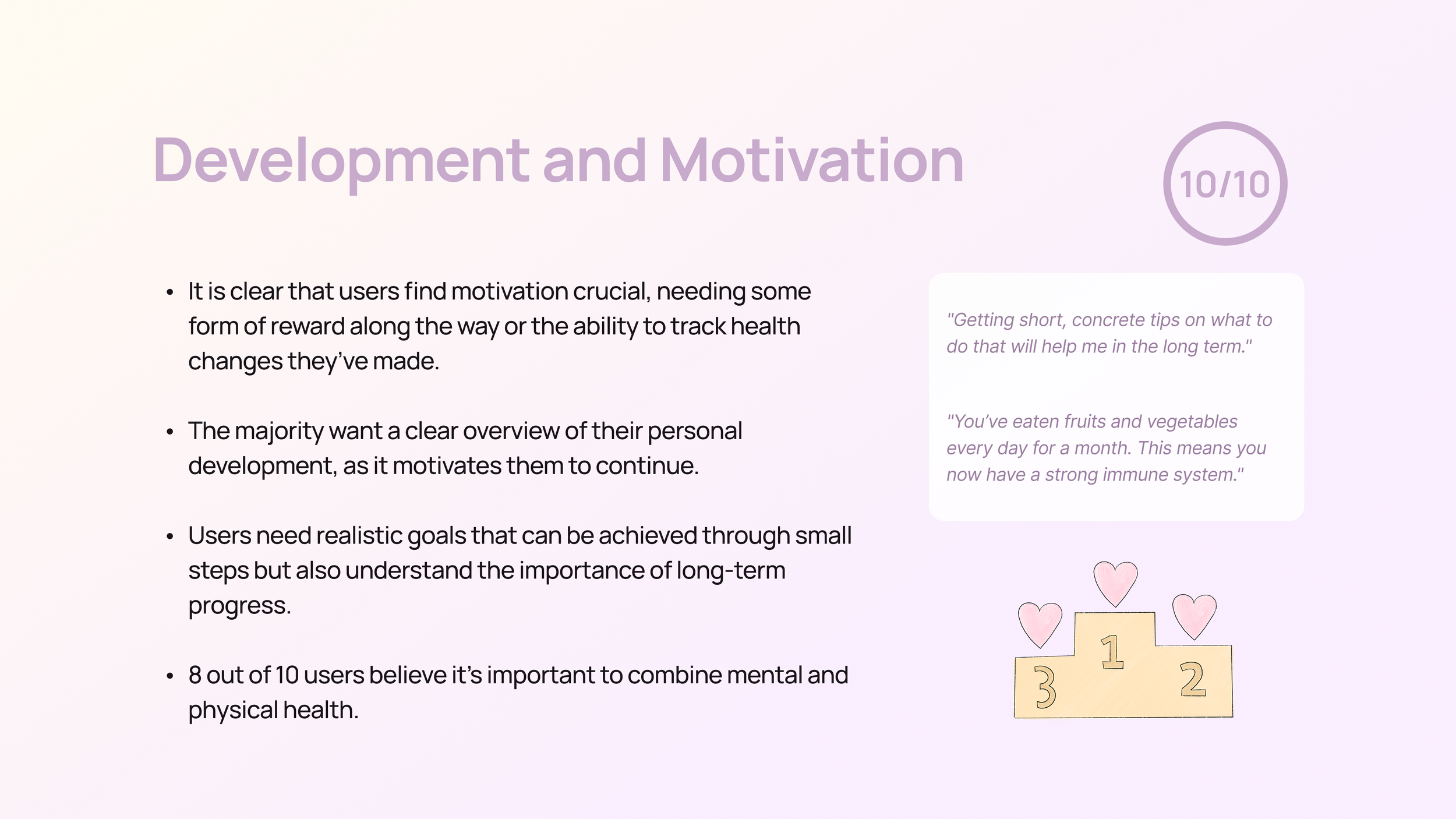
After conducting our interviews, we analyzed the participants and categorized them into two distinct behavior types. We then replaced the "who" section in our experience map with these behavior types.
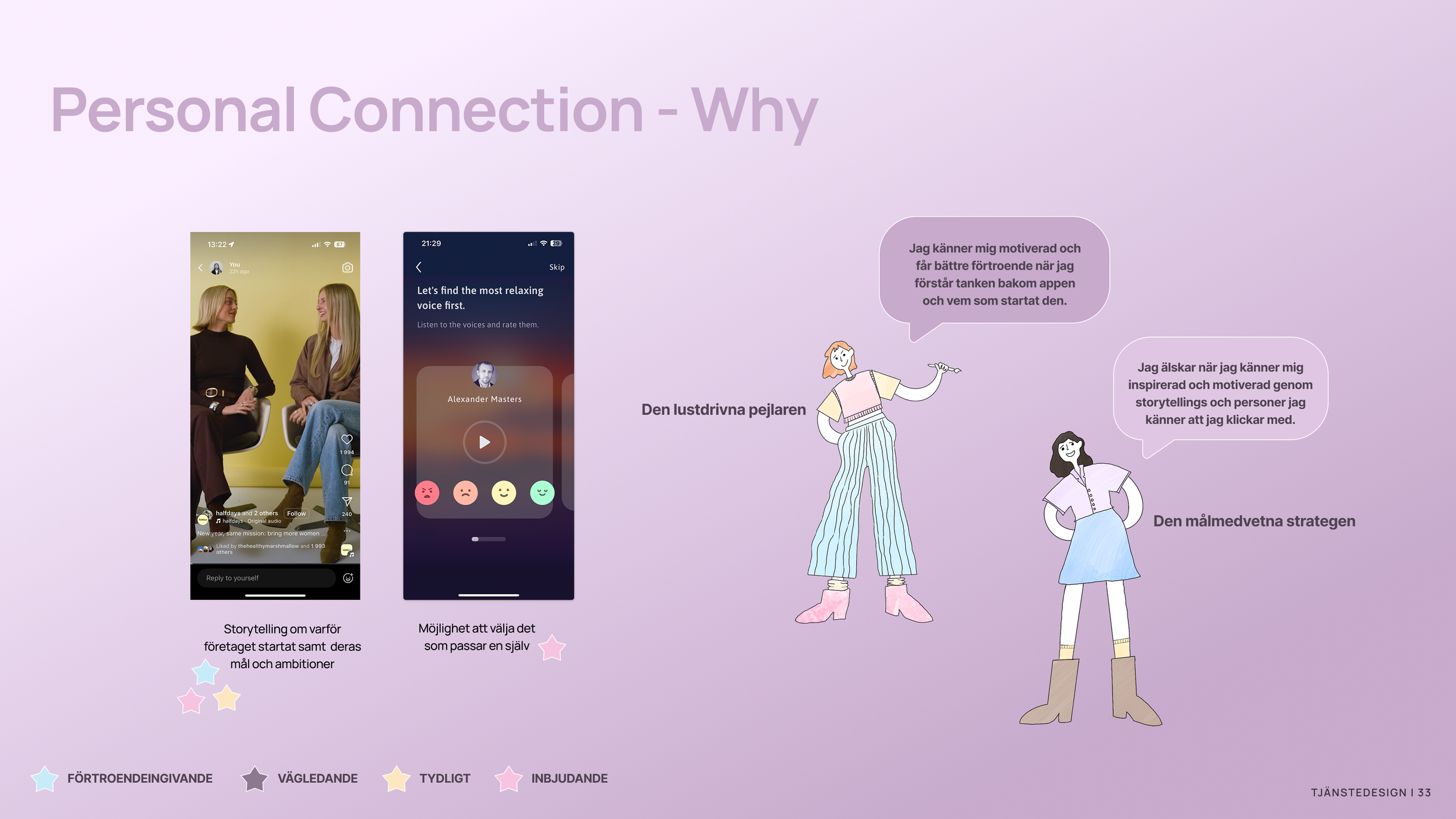
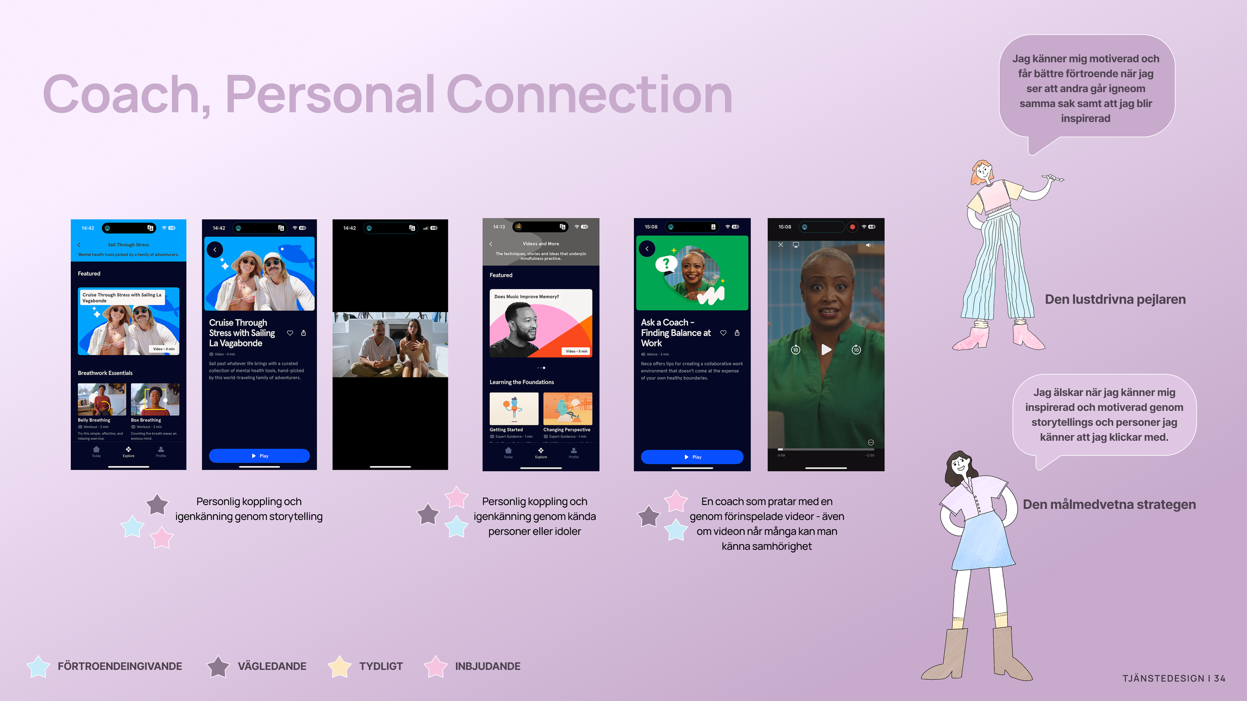
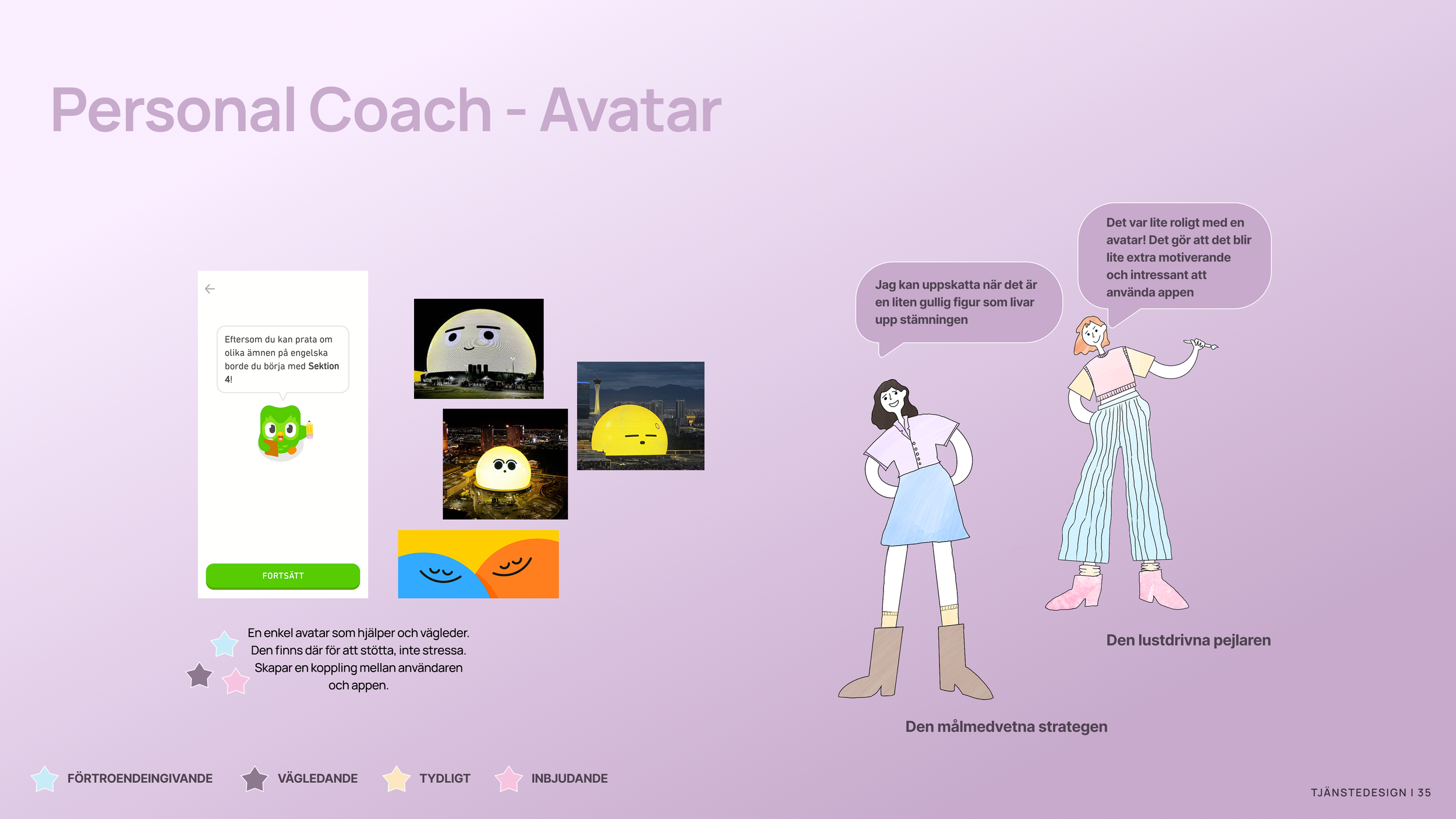
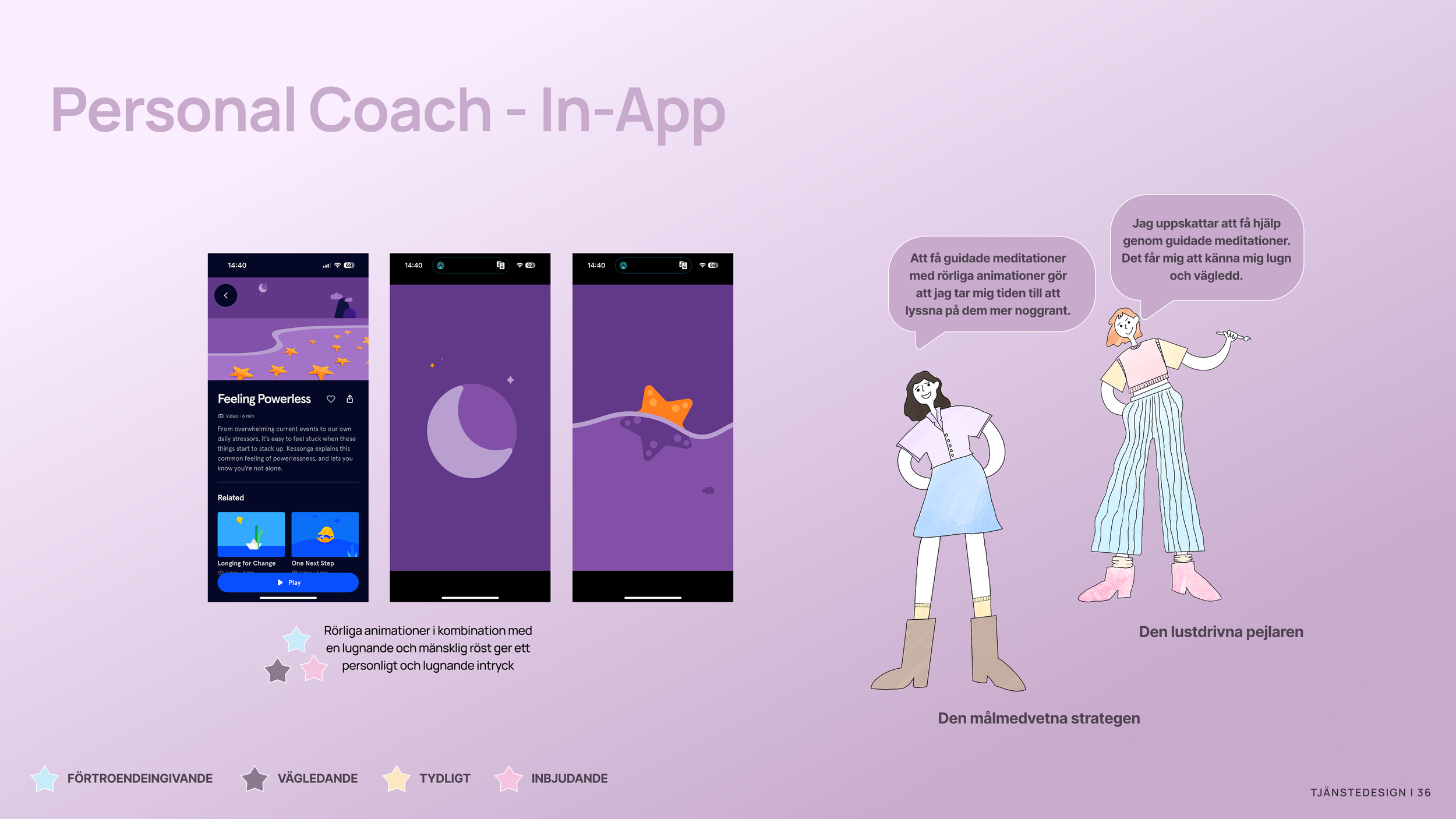
Behavior Types


Service design
To begin the design phase, we held a workshop aimed at generating ideas for features and finding a structure for an app that promotes behaviors supporting healthy habits and better well-being for both the strategist and the explorer. We focused on creating an experience that is inviting, clear, guiding, and trustworthy, ensuring users feel supported and engaged on their journey toward their goals.
Workshop
To concretize the ideas from the workshop, we drew inspiration from other apps and their approach to structuring user flows and interactions. We analyzed how different solutions could contribute to a clearer and more user-friendly experience.
Based on our behavior types, we explored design choices that best meet the users' needs and created ideas that adapt to their different ways of interacting with a service.
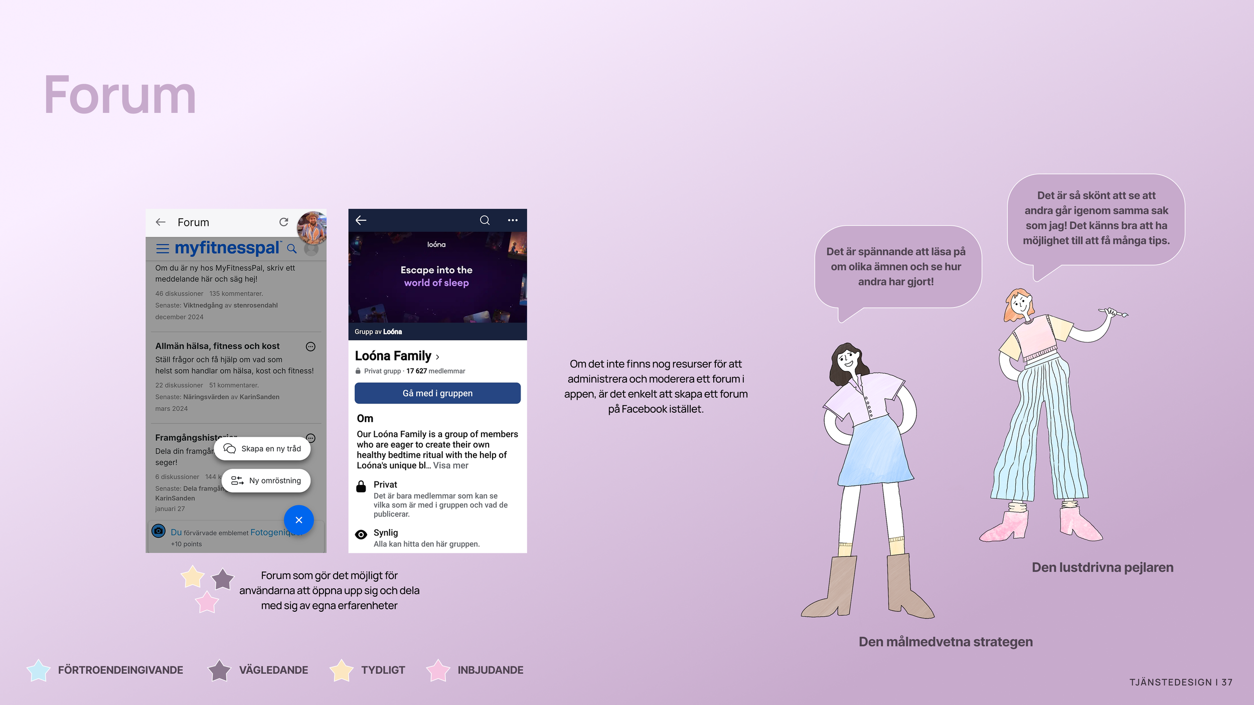
We created these idea posters to showcase examples of concepts we wanted to include in Heyhabit.
Idea posters
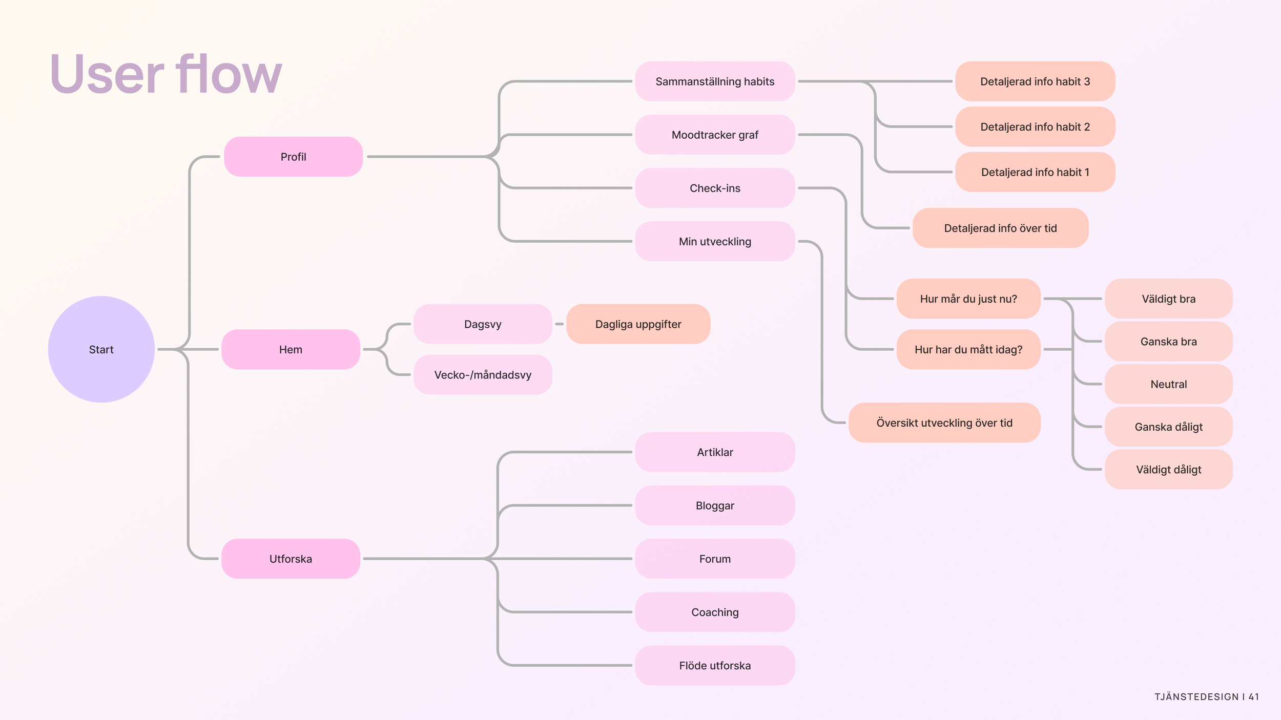
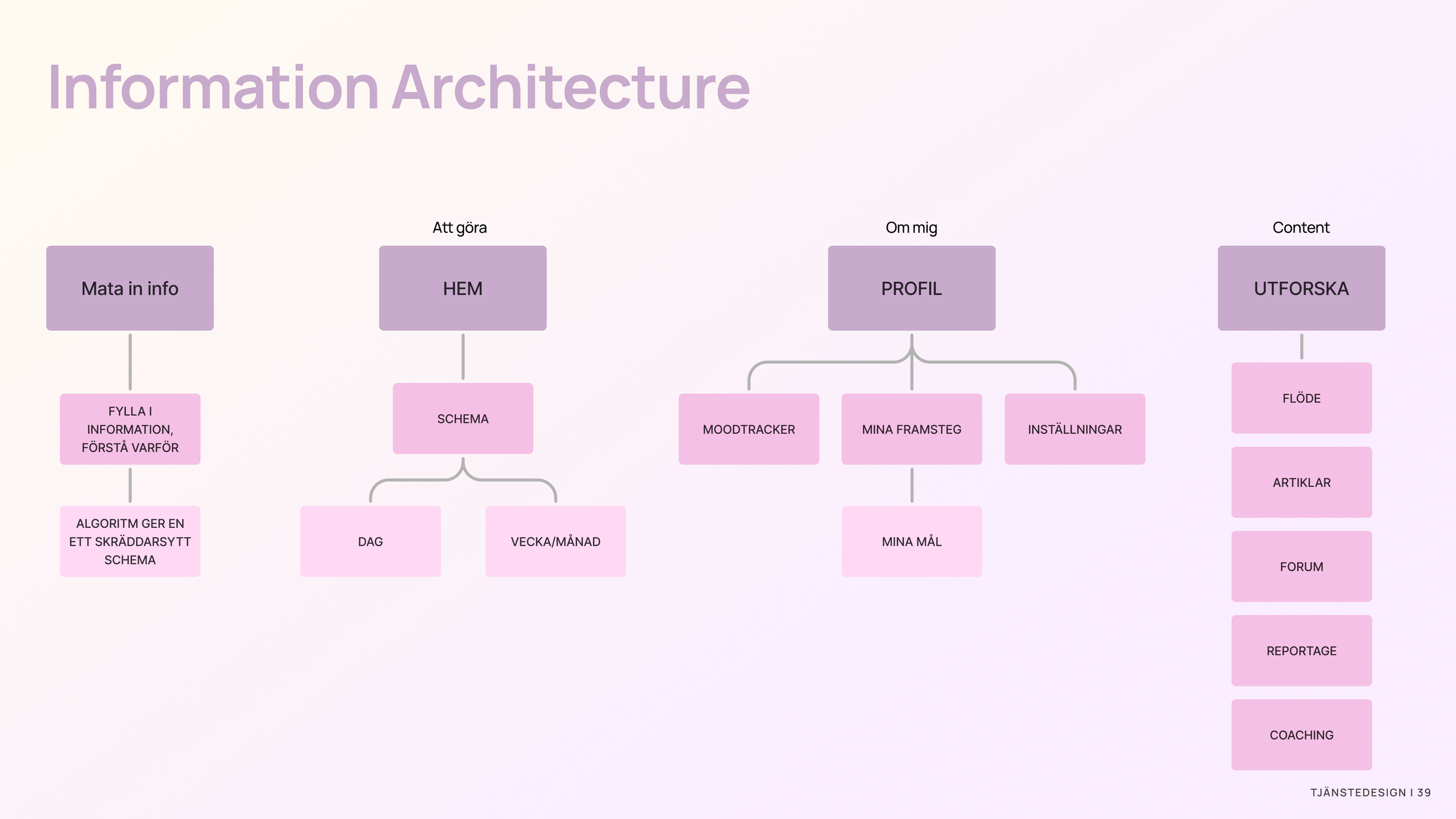
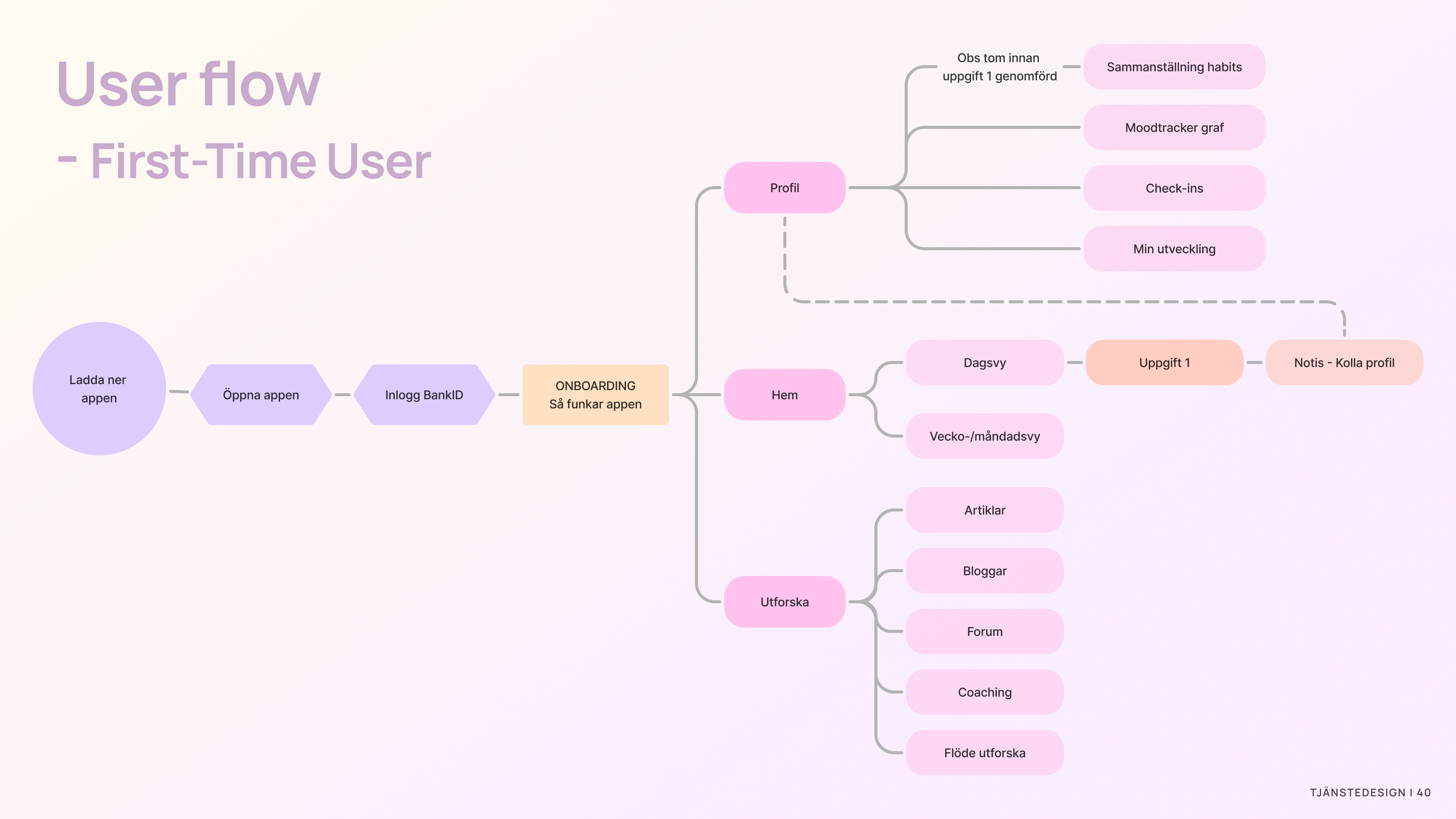
To understand the structure and architecture of the app, we developed an information architecture and a user flow for Heyhabit.
Structure
As a first step, we sketched out hand-drawn wireframes to visualize the app’s layout and user interface. These wireframes helped us quickly explore different design concepts and structure the flow of key features.
Wireframes


Dartboard
We prioritized our ideas using a dartboard method, first within our own team and then together with Heyhabit. During the prioritization process, we focused on how each idea would promote behaviors that support healthy habits and improve well-being. This approach allowed us to align our concepts with the core goals of the app, ensuring that the most impactful ideas were given top priority for development.

Usability testing
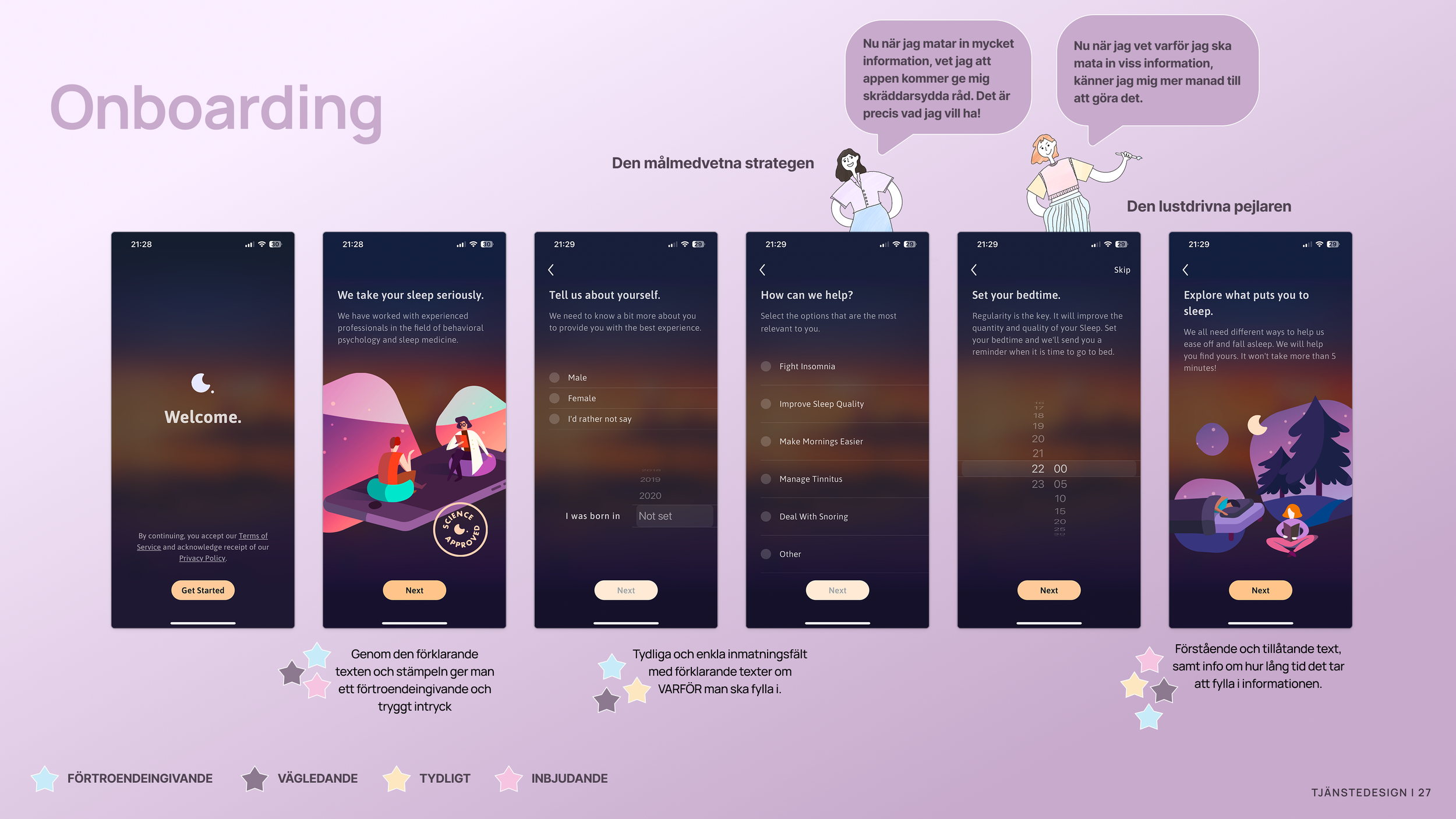
Based on the dartboard prioritization, we decided to focus on "Onboarding - information input," as it is a crucial part of ensuring Heyhabit works effectively and provides the best support possible.
We opted for a short onboarding process that asks a few key questions before granting access to the full app. We realized that a lengthy onboarding could cause users to lose interest before experiencing the "real" content of the app.
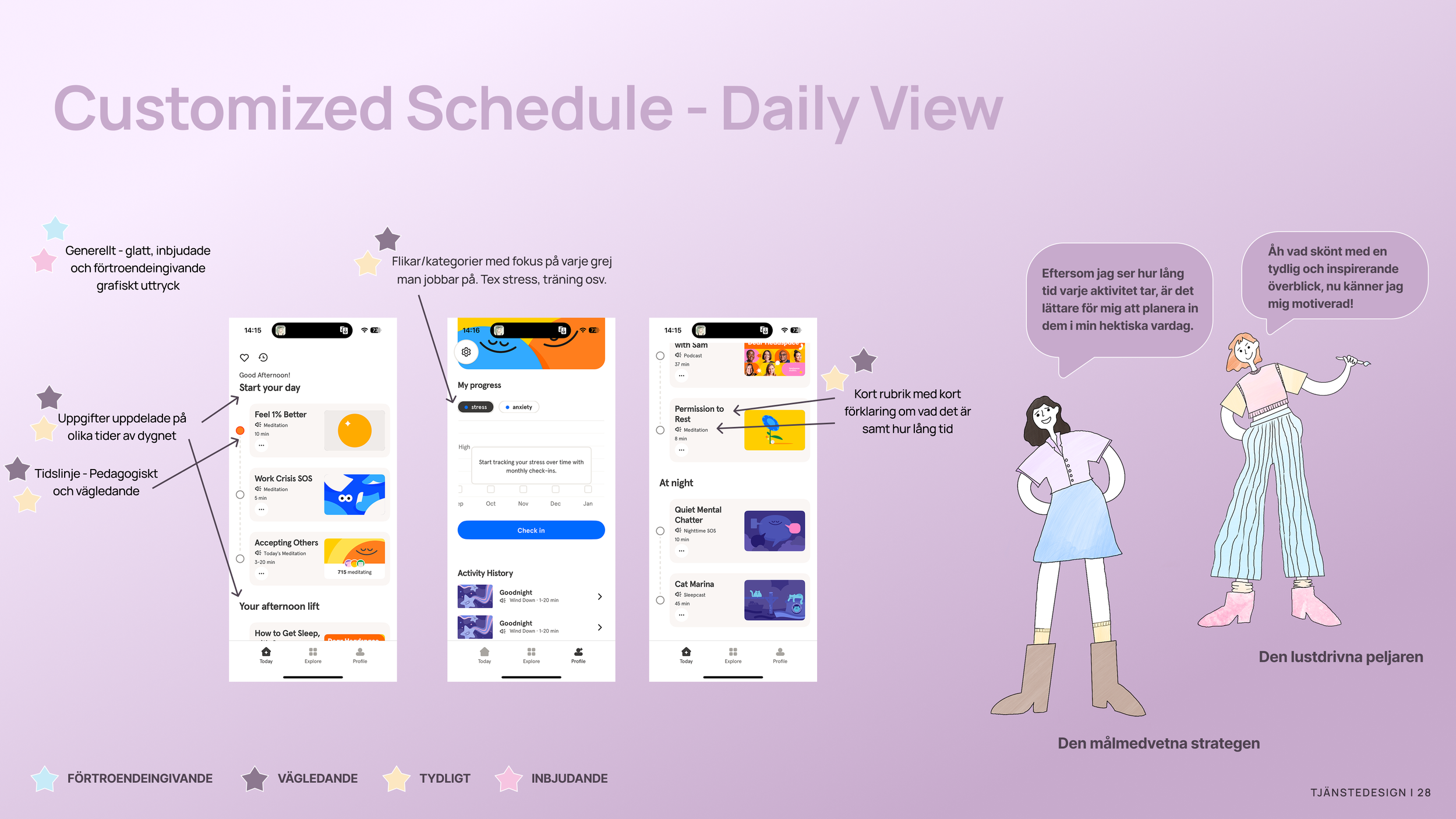
Once we had created the onboarding flow, we chose to reuse its structure in the "Daily View," in the form of "Habits." This further facilitates information input for the user, as the questions are divided into themed "blocks" that are spread out over time.
Onboarding/information input, the daily view schedule and calendar, as well as the profile view, were the elements we, together with Heyhabit, decided to sketch and create a prototype for, which we later used in our usability testing.
Prioritize

Lo-fi prototype for testing


Usability testnig
Prototype:
Based on our idea prioritization with HeyHabit, we chose to focus on the concept of "Information input" – how questions and answers are presented in the app.
We also tested the app's overall flow to evaluate how user-friendly and natural it feels to navigate between different views.
Method and Test Participants
Controlled and supervised observation – prototype testing, conducted both digitally (remotely) and on-site.
Performed with 5 participants, all from the initial interview.
Scenario and Execution
First-time users who have just downloaded the app and are testing it for the first time. The participants followed the instructions in the app and received guidance from us when needed. They were given the scenario and then asked to interact with the digital prototype. We encouraged them to think aloud and occasionally answered follow-up questions. The tests were recorded.
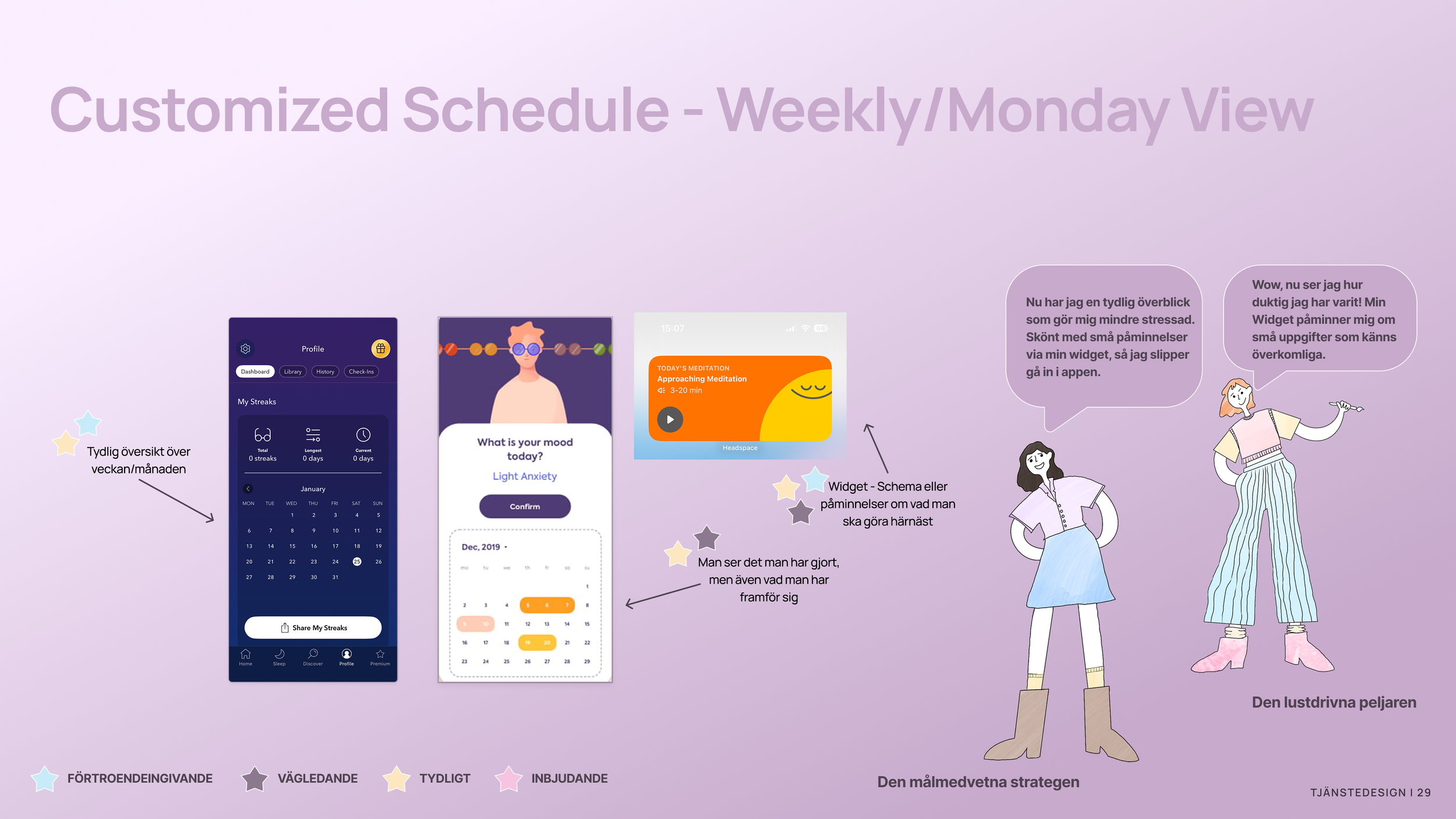
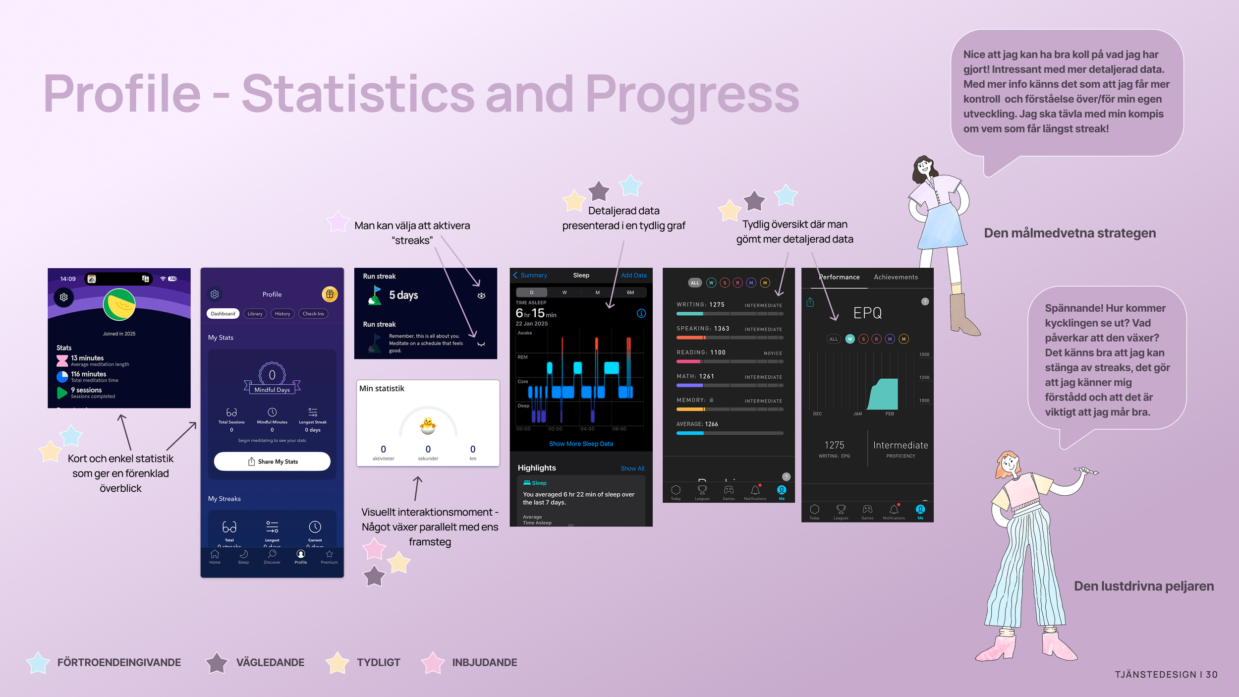
After conducting our usability tests, we gathered key insights and prioritized actions based on their potential value for the app and the effort required from our team to implement them. Each action was rated using two indicators: stars (1–5) representing the value it brings to the user experience, and hearts (S, M, L) indicating the size of the task for us to adjust.
Our prioritization was guided by the core questions that have shaped the entire project: How can we make the app feel inviting, clear, welcoming, and trustworthy?
Insights and Action Prioritization
Wireframes
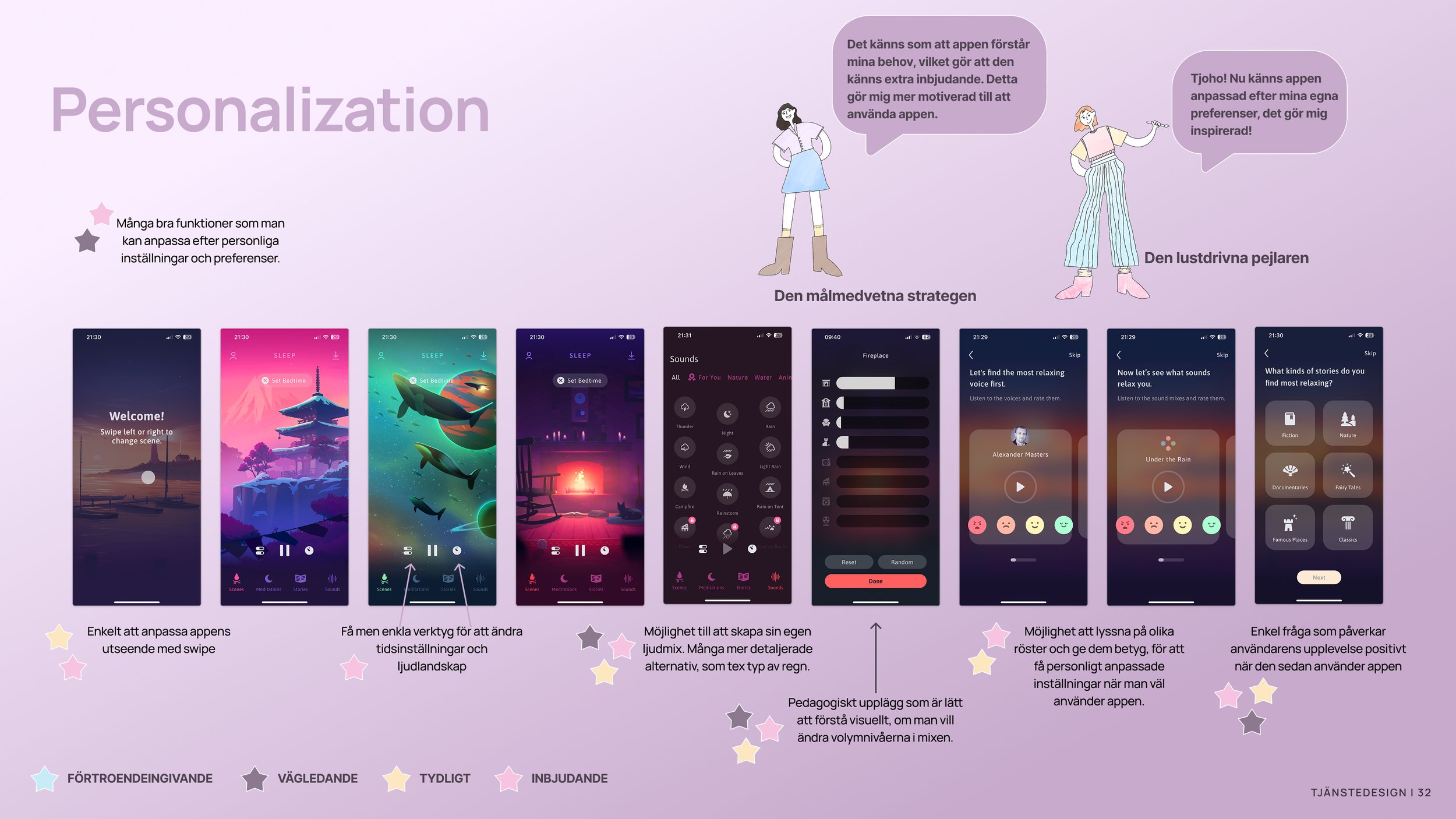
Both the visual design and tone of voice will have a significant impact on how the app is perceived, and therefore play a key role in supporting our guiding principles – making the experience inviting, clear, supportive, and trustworthy.
This is a substantial part of the work that we didn’t have time to fully explore during the course. However, another team member and I will continue to develop this further.
These wireframes offer an example of how the app could look with a color scheme based on HeyHabit’s current visual identity.
Design


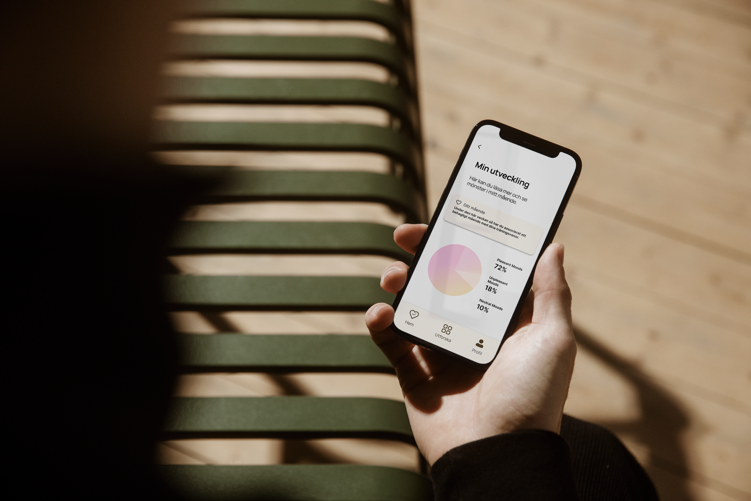
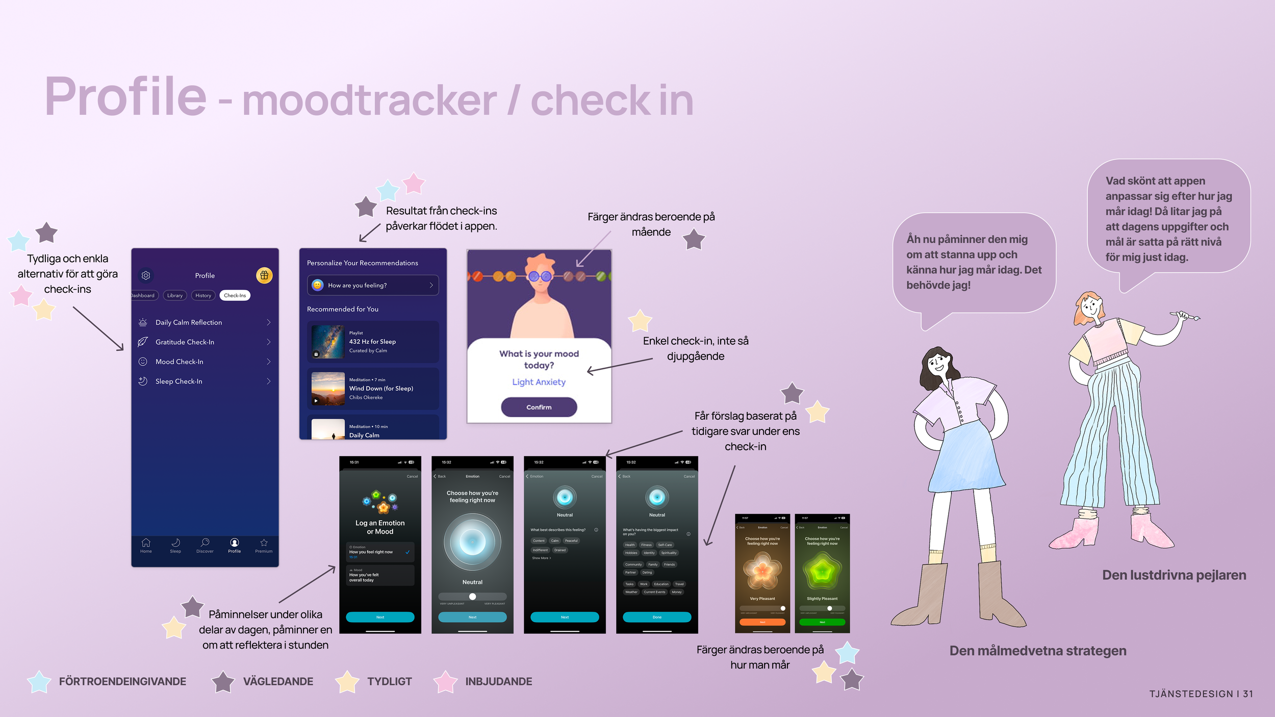
As the final individual task in the project, I chose to further develop one of our concepts. I created new wireframes and conducted an additional usability test with five participants. The idea I explored was the Check in, a feature that allows users to log how they’re feeling in the moment, throughout the day, or across the week.
My focus was on testing the user flow, the response options, and how the data summary was experienced. Before testing, I also applied visual design to better understand how users responded to the overall look and feel.
Individual part
This usability test provided valuable insights for future development of Heyhabit. The app is on the right track, but there’s room to improve clarity, copy, and tone for an even better user experience. The check-in feature stood out as especially meaningful to participants, offering value to both user types. Another insight was how positively participants responded to the light, soft design, describing it as welcoming, calm and empathetic.
Insights


As mentioned earlier, two members of our original four-person team, including myself, were given the opportunity to continue working with HeyHabit beyond the scope of the course. What started as a school assignment has since developed into an ongoing collaboration around a real product in development. It has been both an exciting and highly valuable professional experience.
We have taken full responsibility for the UX/UI design and continue to collaborate closely with the founder throughout the process, guiding the product from concept to a live test version.
The work continues as we move into user testing and further iterations ahead of launch. More to come.
Future work